Moroki Mātauranga Māori Digital Resource Center
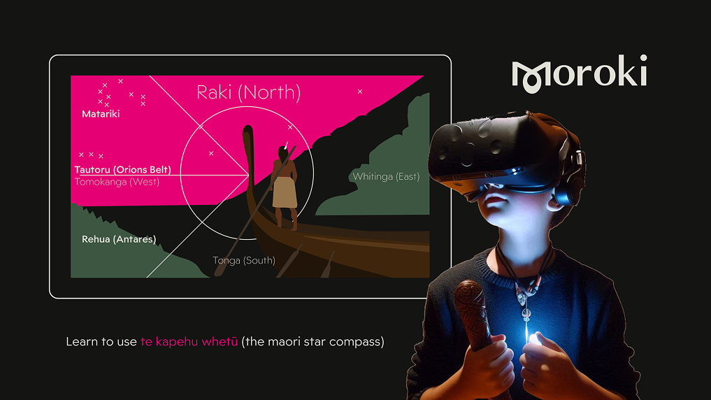
A digital resource centre grounded in Te Ao Māori for tamariki and rangatahi to learn mātauranga māori using immersive technology.
Brief
Discover a real-world problem in your local area and design a solution based on extenstive field and user research.
My Role
UX Design, UI Design, UX Research, Copywriting, Brand Identity, Colour Palette, Typography

This project addresses the lack of modern, accessible resources for Māori—especially tamariki (children) and rangatahi (teenagers)—to engage with Te Ao Māori, mātauranga Māori, and their whakapapa in meaningful ways.
Growing up in Tauranga, I saw how Western media captured the attention and imagination of young Māori, including my own. I wanted to create equally engaging tools that inspire pride and curiosity in our own culture—to compete with the technological advancements in Western media, music, and sports.
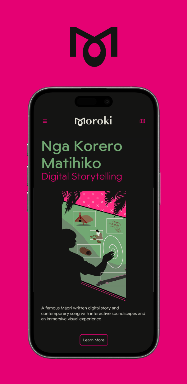
The idea began with traditional Māori gardening practices and tools like the kō, aiming to reconnect users with the maramataka and mātauranga Māori through wānanga (overnight learning stays). But research revealed a strong desire for more interactive, tech-driven experiences—especially among youth. This insight led me to pivot toward a hybrid solution that blends digital immersion with tikanga Māori, ensuring cultural depth, relevance, and ethical integrity.
I began by understanding the current learning needs of tamariki and identifying gaps in culturally grounded digital resources. Research insights led me to shift the design from a purely physical learning centre to a blended model—one that integrates technology with Te Ao Māori in a meaningful way.
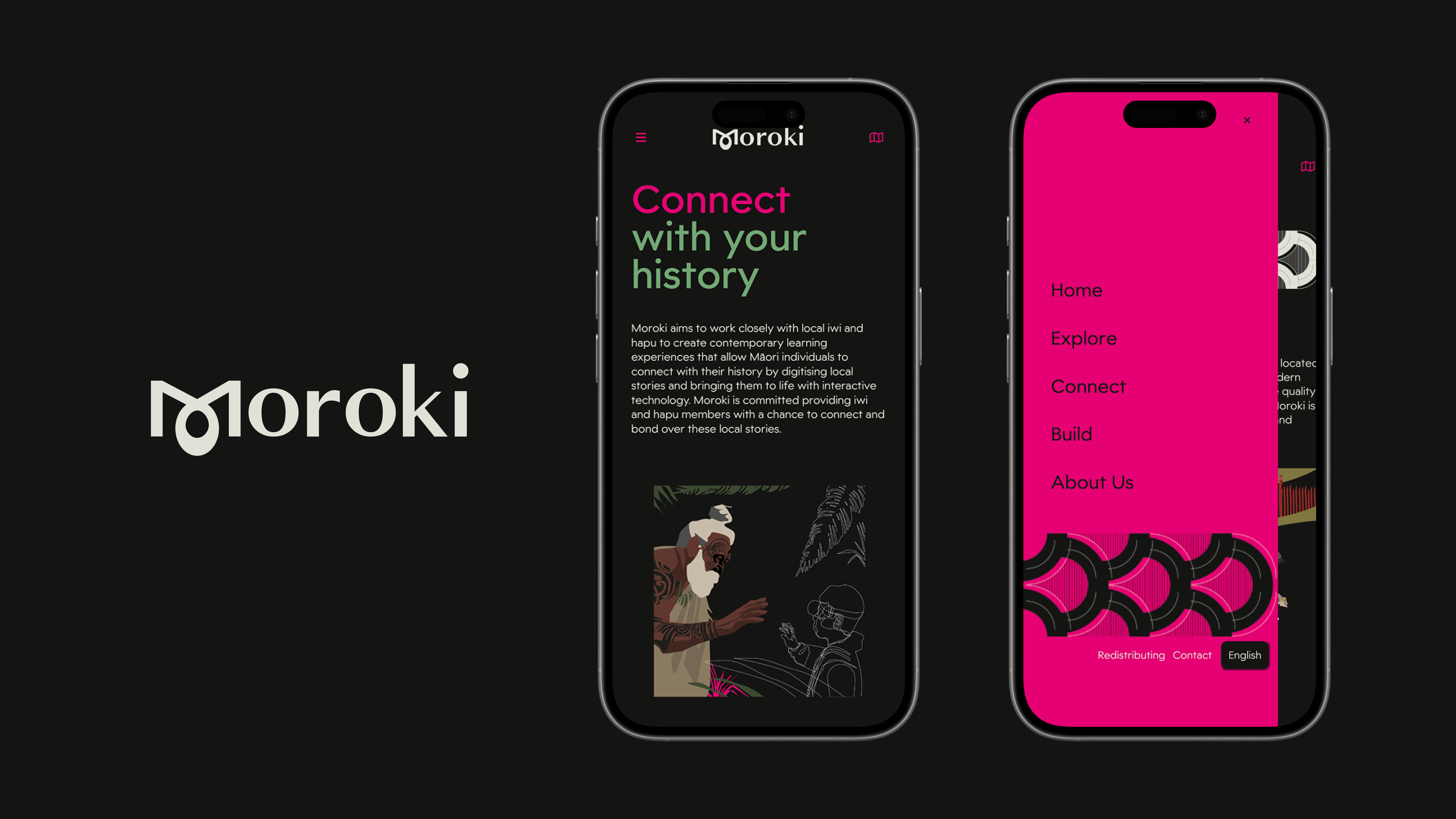
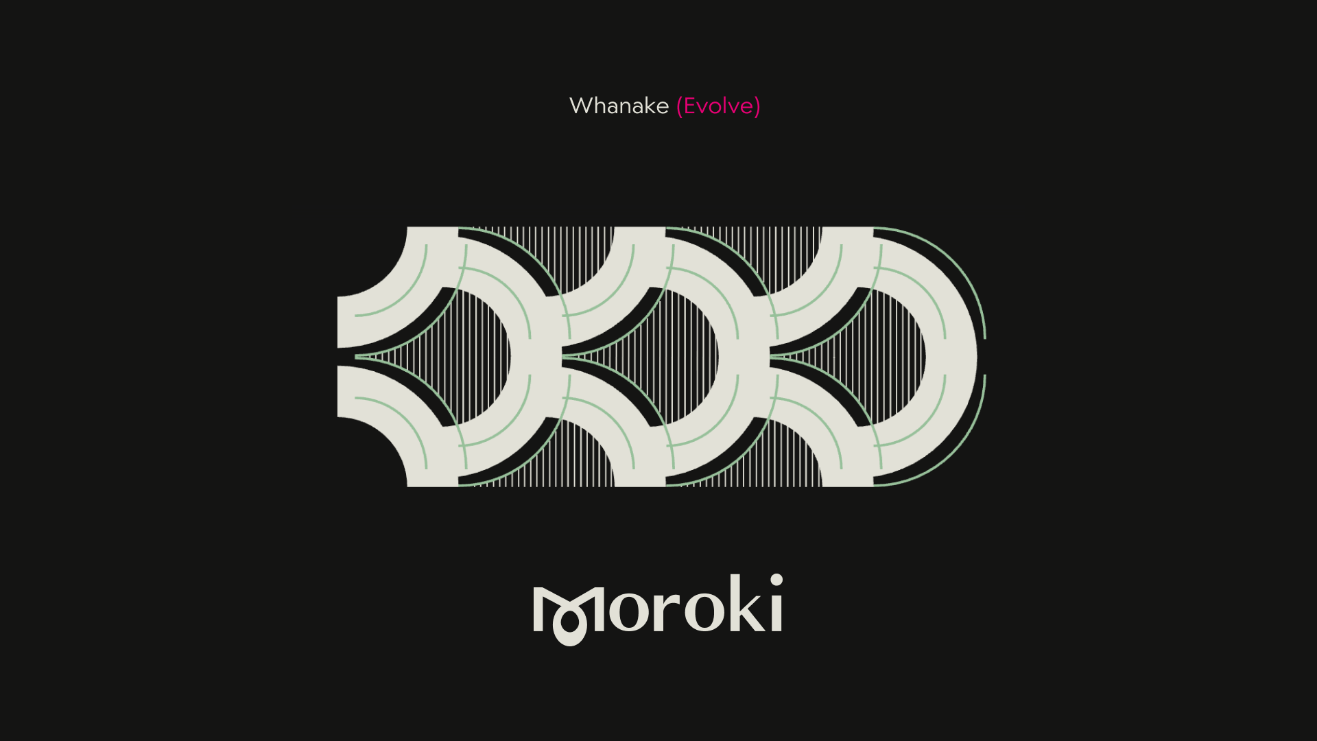
I honoured traditional Māori materials and taonga in the colour palette: pounamu green, obsidian black, and whalebone white. The bold neon pink is a contemporary evolution of the red from ngūkākā, chosen to feel as though it’s saturated through the pixels of the digital world. It represents visibility, inclusivity, and modern expression—symbolising the journey from the natural world to the digital realm.
The app and website were designed as a digital wāhi tapu—a sacred, intentional space. Every element of the interface—from copy to layout—was minimal, meaningful, and culturally grounded. I used tone and language to cultivate calm, clarity, and respect throughout the user experience.
Inputs
Process
I followed a design thinking approach throughout the project, beginning with extensive research and empathising with the target audience — the tamariki of Aotearoa. This initial phase involved creating affinity diagrams, conducting competitor analysis, mapping user journeys, and developing wireframes during the define stage. I then moved into the ideation phase, where I explored core values, copywriting, typography, and colour palettes before progressing to usability testing and iterating wireframes.
Research Insights
My initial focus was to understand the current educational needs of tamariki and identify gaps in culturally grounded learning experiences and digital resources. Extensive research, including surveys and secondary sources, revealed varied and layered insights. Key challenges included limited funding, urbanisation of Māori populations away from ancestral land, and the dominance of Western entertainment and fast food as major distractions for rangatahi Māori.
Survey responses reflected excitement about digital opportunities, but also highlighted the importance of wānanga (immersive traditional learning experiences) and upholding tikanga Māori. These findings shifted the design from a solely physical, garden-based learning centre to a hybrid model — balancing immersive digital engagement with tikanga-led wānanga experiences.
Outputs
Contemporary vs Traditional
The project began as a mātauranga Māori wānanga and traditional garden resource centre. However, user journeys and competitor analysis revealed the opportunity to integrate digital experiences that could both compete with Western distractions and elevate cultural values.
This led to a pivotal decision: should the identity lean traditional or contemporary? I had identities ready for both, but I chose the contemporary route partly inspired by my desire to learn during a safe, school project, but also based on my target audience and early empathy mapping suggesting modern visuals were refreshing when done correctly. This lead me to name the project Moroki — meaning “to continue.” This represented a bold step toward innovation grounded in culture, symbolising progress with purpose and cultural continuity. It highlighted a contradicting pressure-point in my user research, and tested me with critical design thinking.
Colour
The colour palette was refined through an intentional selection process. Subtle hue shifts in white and pink distanced the design from other Pacifica aesthetics, such as flowers from wider Polynesian cultures, and more towards the bold pink hues in ngutukākā flowers, while pounamu green and obsidian black anchored the identity firmly in a uniquely Māori visual language.
User Interface
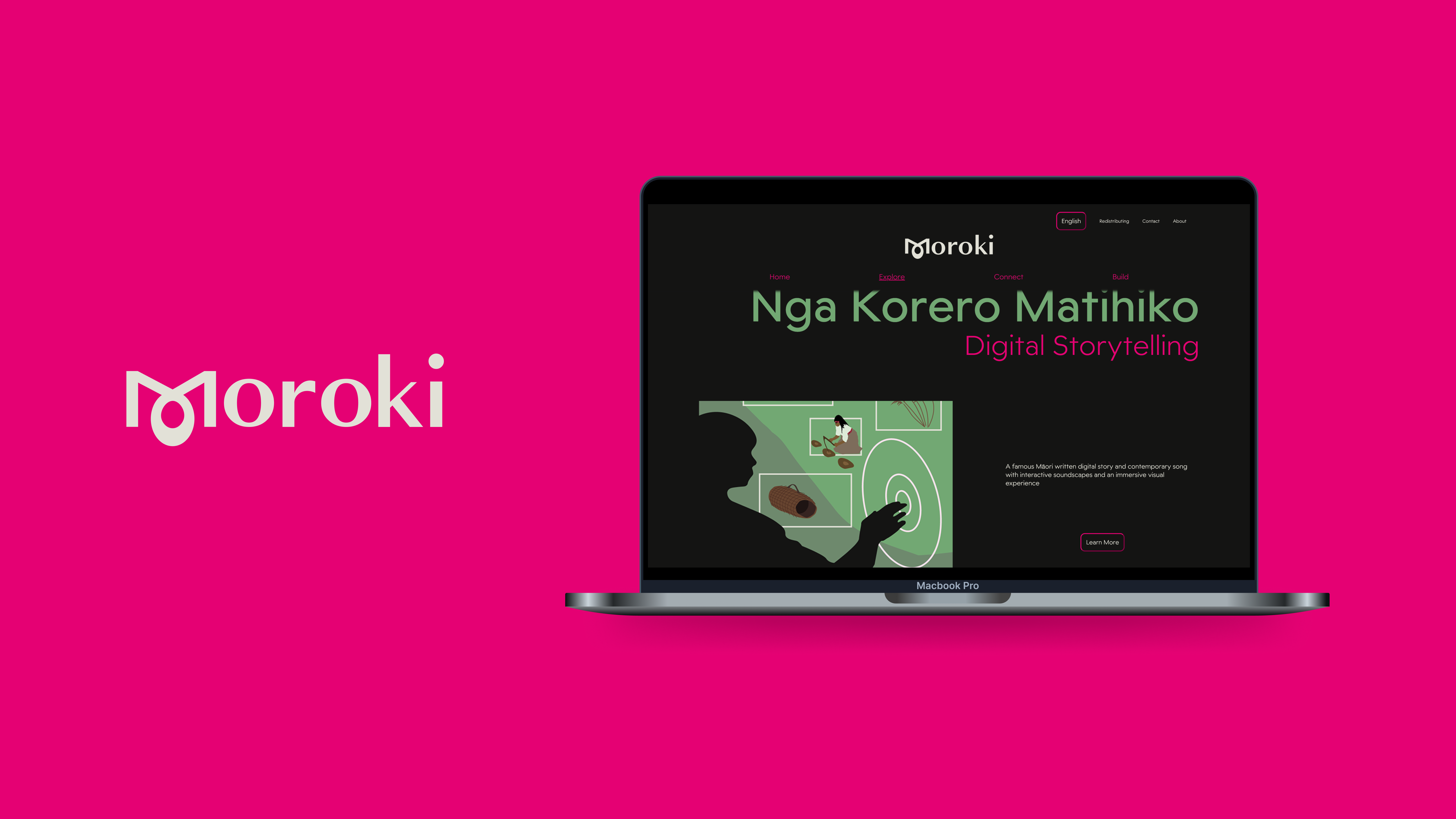
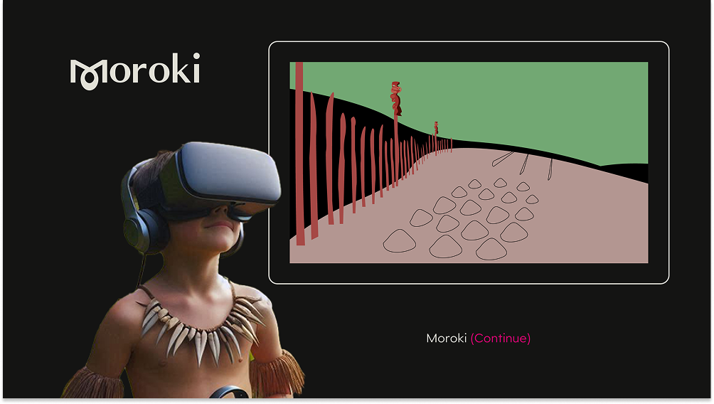
A major challenge was crafting a modern digital identity that was still accessible for kaumātua and older Māori users. I addressed this by focusing on clarity, simplicity, and intuitive flow. The site structure was minimal, and I removed the bottom nav bar in favour of a central, four-option menu: Home, Explore, Connect, and Build.
This UI was imagined not just as a tool but as a taonga — a natural, spiritual extension of the user’s wairua. The interface was calm, guided, and intentional — designed to feel alive and culturally resonant, not sterile or mechanical.
Outcome
The final concept positioned Moroki as a collaborative initiative between iwi, hapū, cultural leaders, and digital experts — a space where mātauranga Māori and emerging technology coexist to empower future generations.
Design tools